
Overview
This is a project I did for an organization called SheDevOps, a women-led organization for research and innovation in healthcare.
The objective was to develop an application tailored for women affected by Attention-deficit/hyperactivity disorder (ADHD). SheDevOps had already conducted extensive research to identify specific target segments. As a UX Designer, I collaborated with fellow designers, developers, and the SheDevOps team to bring this vision to fruition.
What’s the Problem?
ADHD is frequently misdiagnosed in women, with research indicating that 12.9% of men receive diagnoses compared to only 4.9% of women.
This large diagnosis gap is due to gender roles, hormonal fluctuations, and worrying about one’s self-esteem and self-harm. Also, there is a stigma surrounding it. Because of this, there is a lack of resources that can help them manage their daily activities/tasks.


ROLE
UX/UI Designer
TEAM
4 Designer, 4 Developers
How might we help women with signs and symptoms of ADHD, who may not have a diagnosis, to organize and structure their lives?
Design Brief
The goal of the Olivia app is to help women who may or may not be diagnosed with ADHD
Plan their daily activities
Monitor their menstrual cycle
Get support through community connections and awareness

Research 🔍
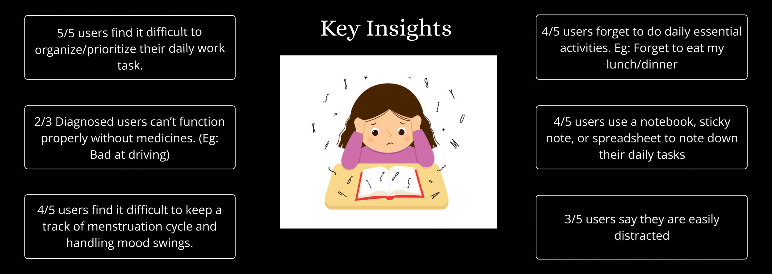
We chose to interview rather than survey people online because the theme of this study is very personal, and surveys don't allow people to express their personal views. We interviewed 5 women who fit the target user demographic, including women with ADHD and women with families suffering from ADHD. We then used the miro board to put all our findings together.

Personas
Information Architecture
UX Design
We decided to begin wireframing and defining a style guide for this application. Since we had a team of four designers, we decided to divide the work according to the features. While we all contributed to each other's pages to some extent, I focused on the onboarding and menstruation screens. Below are a few screens:


While I was working on Onboarding and menstruation screens, the team finished creating wireframes for the To-do list and Awareness. After finishing the mid-fidelity wireframes, we connected with the founder and developers to get their views. Developers were kept in the loop to ensure we were in line with their work and constraints.
Usability Testing
To efficiently evaluate the key workflow, we conducted usability testing with the same group of 6 customers. Key objectives:
Identify any points of unnecessary friction or confusion for users during onboarding
Determine how user feel through the registration process
Determine ease of navigation for users
Feedback 1

Feedback 2

Feedback 3

Style Guide

High Fidelity Wireframes

Know more about the User
After a user logs in for the 1st time, they are presented with a mandatory questionnaire. We are collecting this information to support future work.
I used four dots to indicate the number of questions since there is no skip option.


Splash and Login Screen
Based on user insights, I used a simple and minimalistic design for the login and signup screen.
I used secure sign-up options such as Facebook, Google, and Apple where the credentials are stored in a third-party location to build trust and reduce cognitive load.

App Walkthrough
Users can easily learn about the features of the applications on this screen.
It enhances user understanding and makes it easier for them to adopt the applications.
Home
Users can see all upcoming tasks and the number of days left for their period on the Dashboard.
Each task/event has a time duration, which helps users better manage their day.
Users can view small tasks at the bottom and they can complete them whenever they have time.

Menstruation - Use Case 1
To record the period cycle, the user needs to input details of the previous month's period.
The period tracker will automatically calculate the next cycle based on users' input.
Users can easily switch between monthly or yearly calendar views.
Menstruation - Use Case 2
The user is not unsure about the last period cycle.
Users will be asked to provide tentative information to predict the next cycle

Learnings
Domain knowledge is important - I spend a great deal of time understanding more about ADHD, so I can put myself in the users' shoes.
Documentation is important as stakeholders may switch their preferences back and forth between different ideas
Importance of the Design system when working in a team - Since everyone is working independently in different time zone, it helped a lot to be consistent with the entire product.
Set communication and response expectations - some team members were not responsive on Slack for days at a time
Next Steps
Performing the second round of usability testing after the app is launched to ensure users' needs are met
Adding Self-care tips in the menstruation cycle section
Adding a chat feature to the awareness section to help women exchange experiences
Easy rearranging of tasks - Adding a feature for users to drag events/tasks to reschedule.
Accessibility considerations

